ATHENS 2004 OLYMPIC GAMES
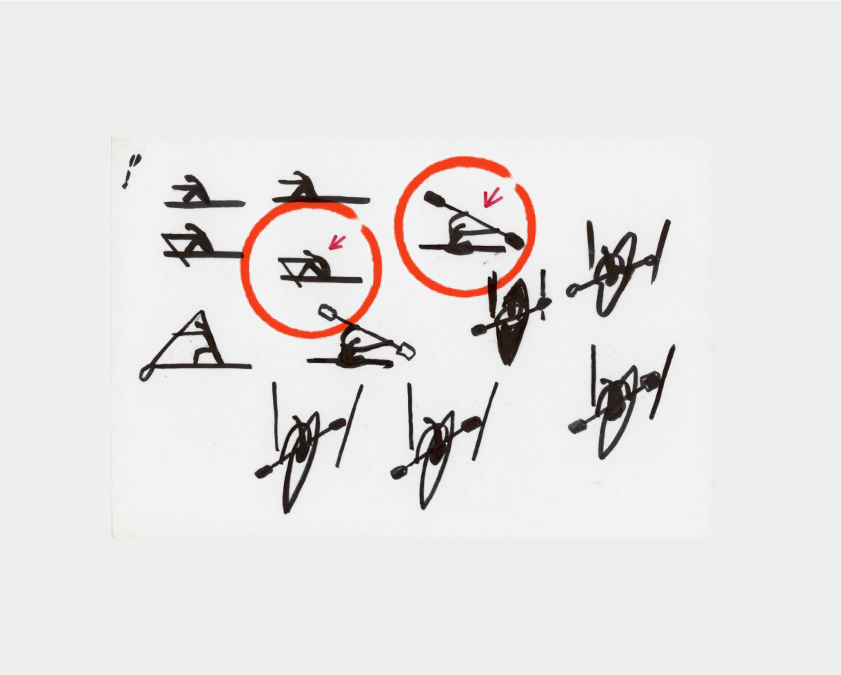
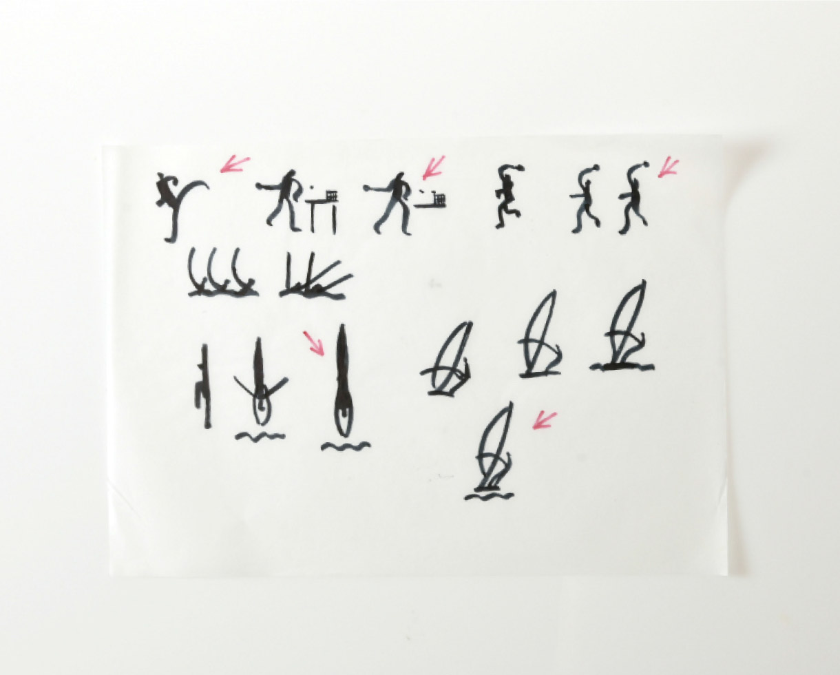
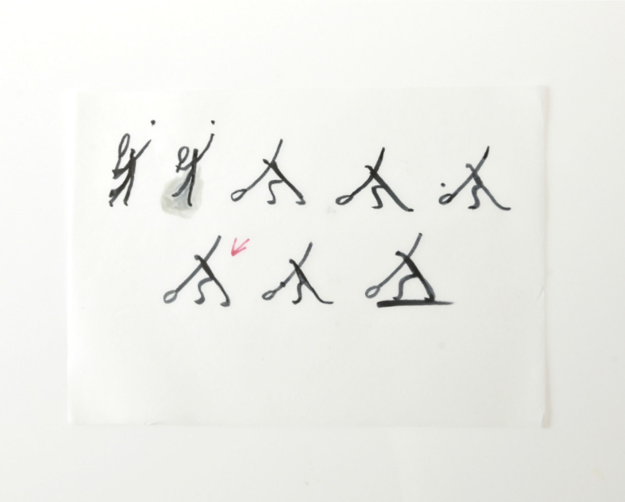
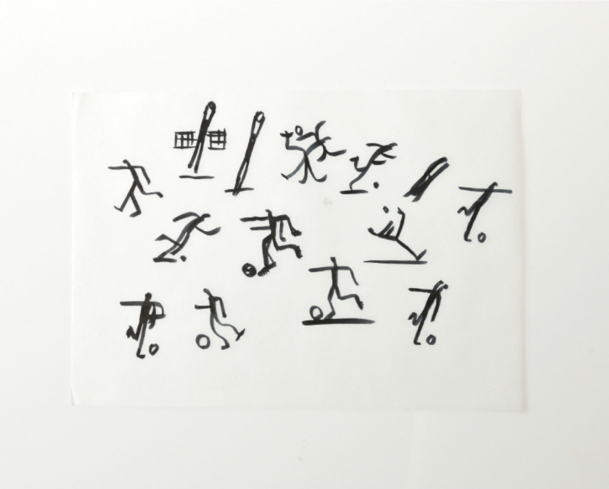
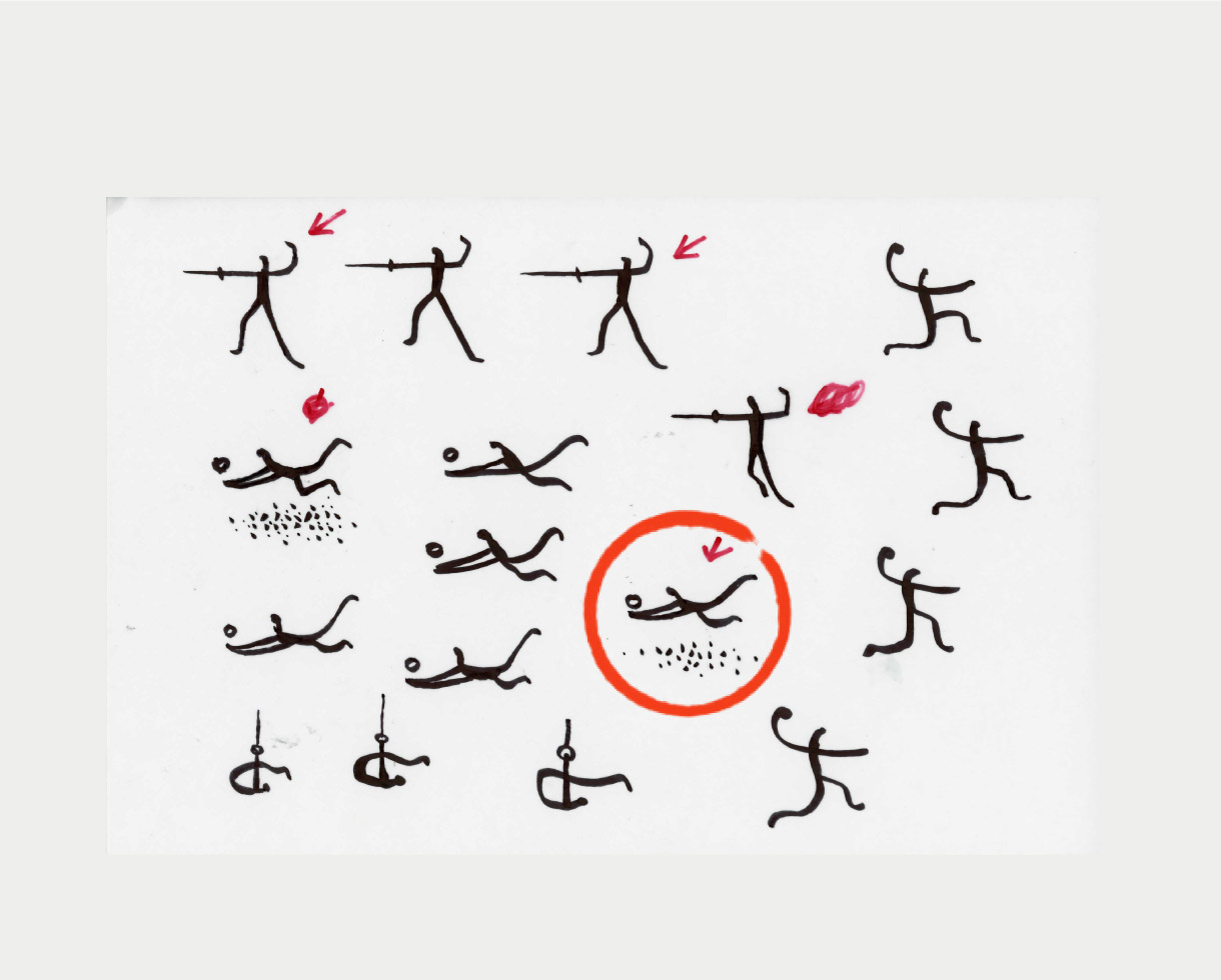
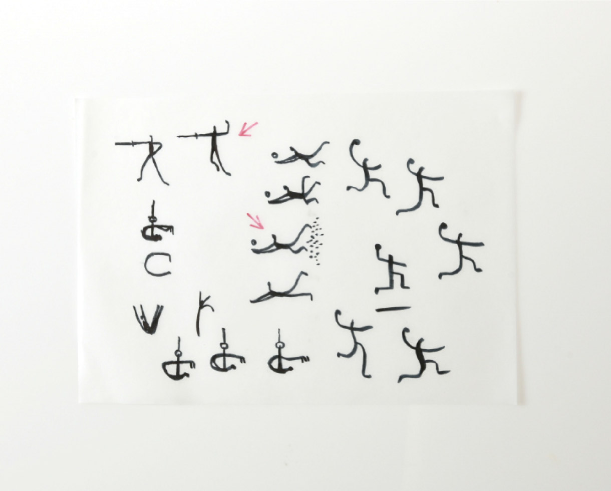
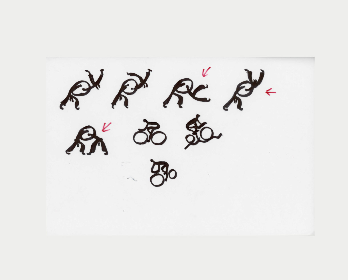
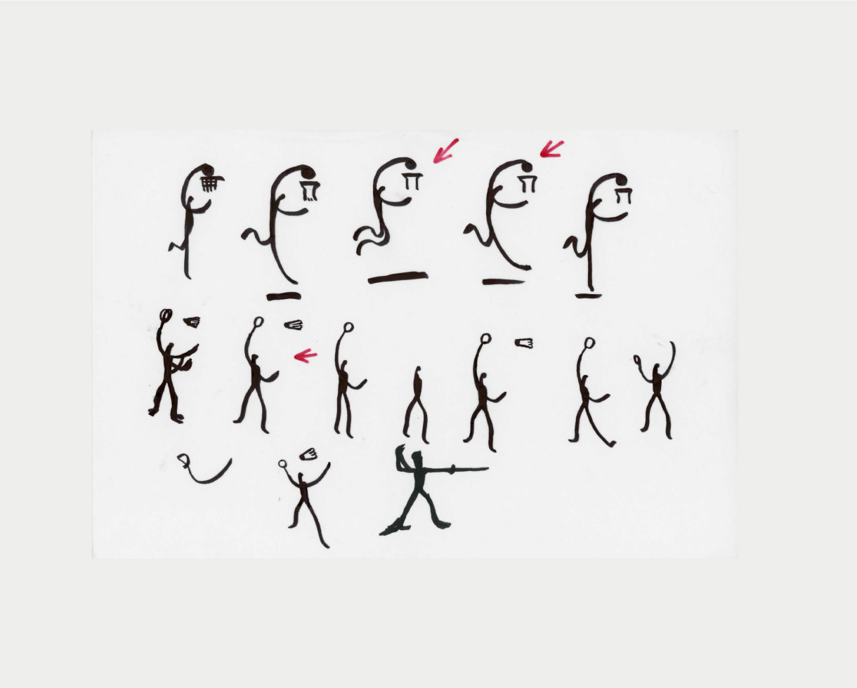
The Athens 2004 pictograms delightfully comic and smartly primitive are a modern version of a frieze. Humorous and exquisitely functional they are a welcome addition to the pantheon.
Steven Heller, New York Times
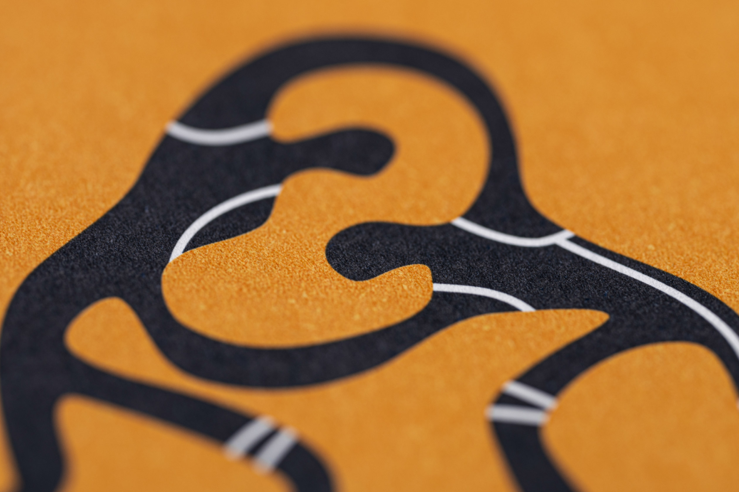
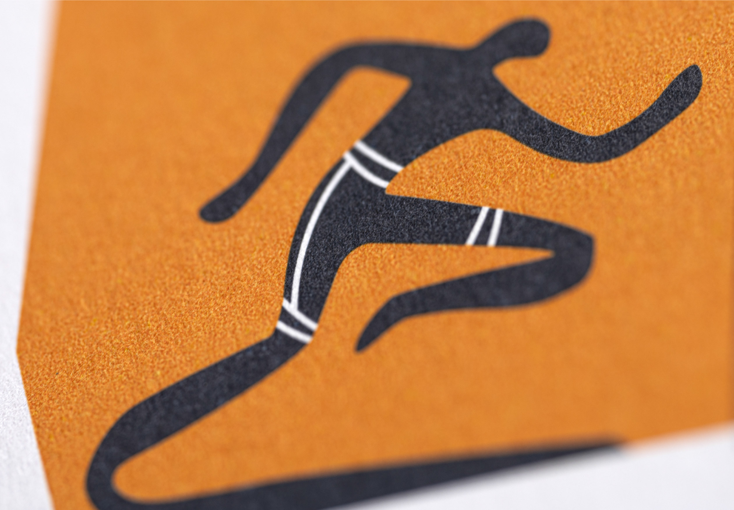
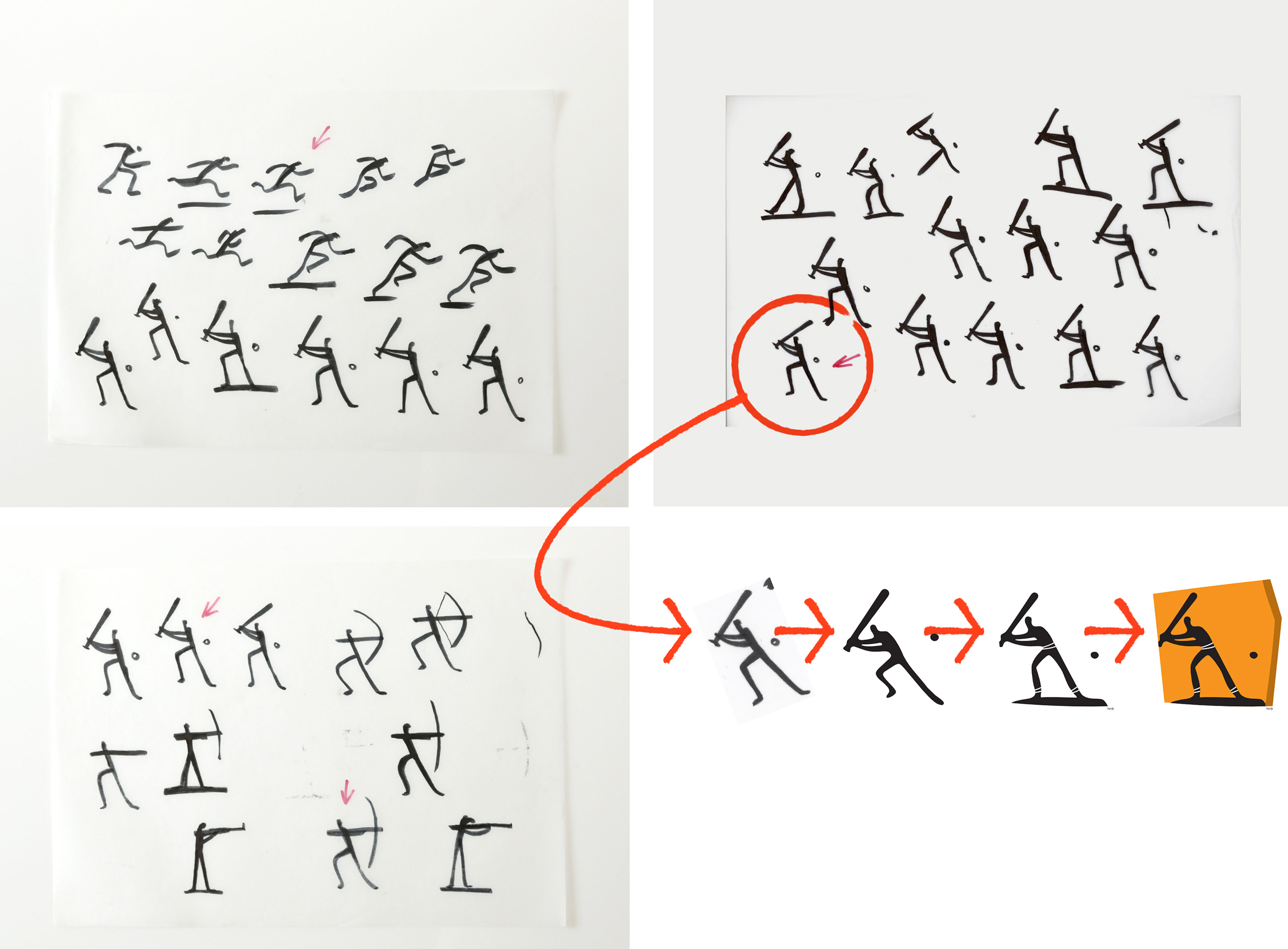
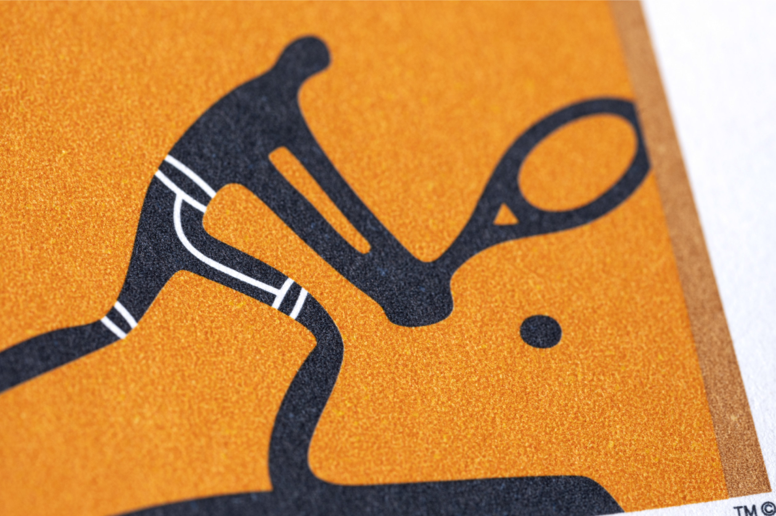
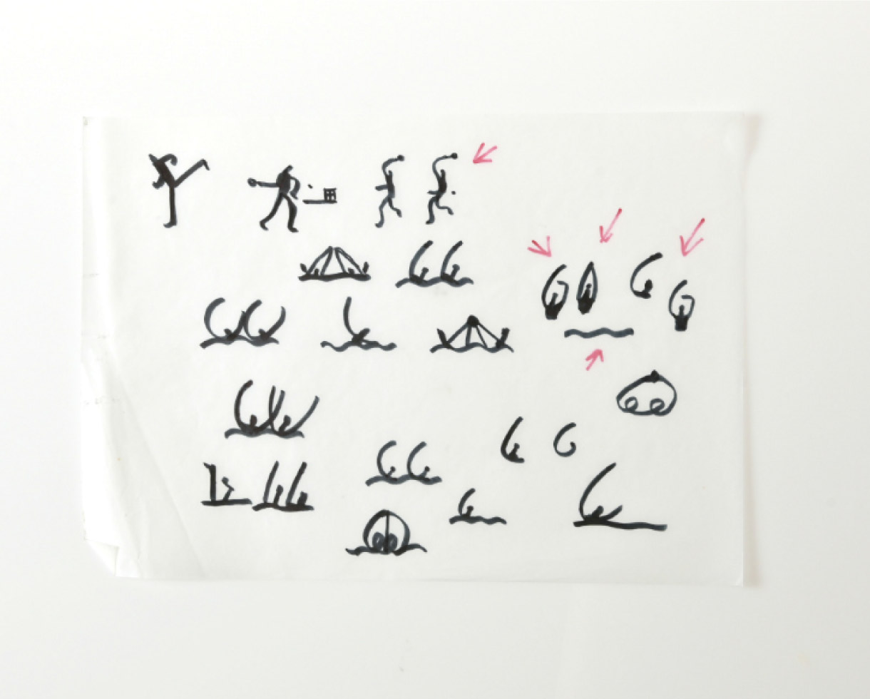
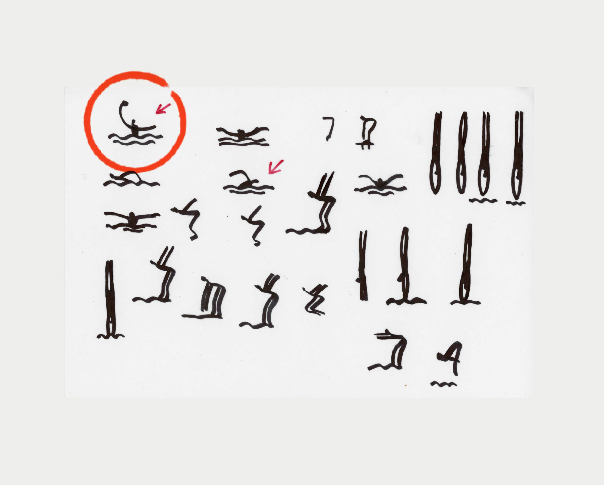
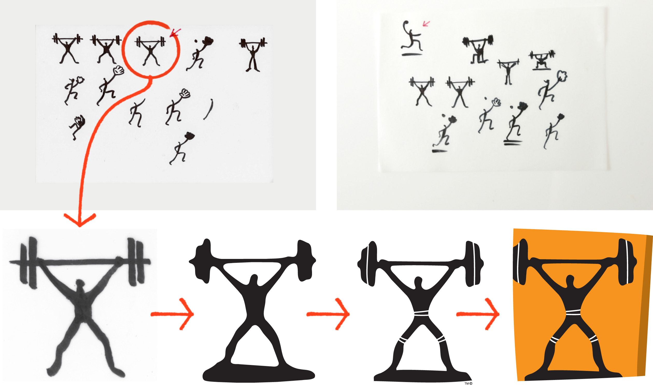
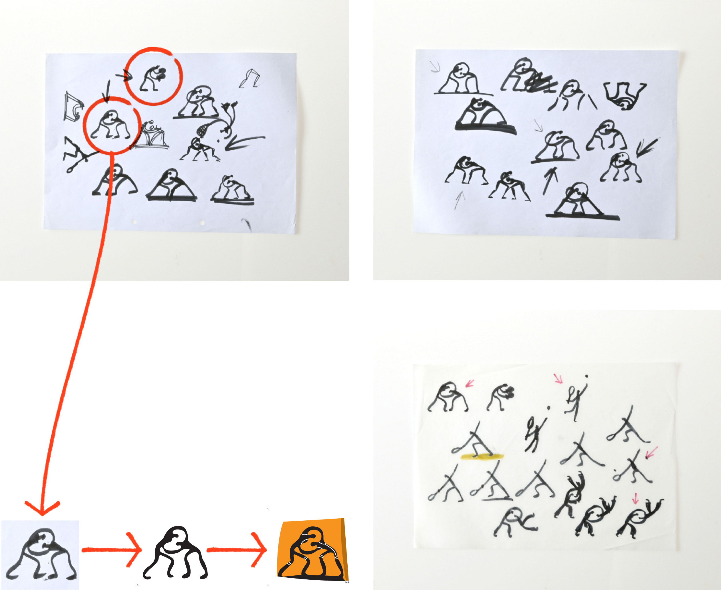
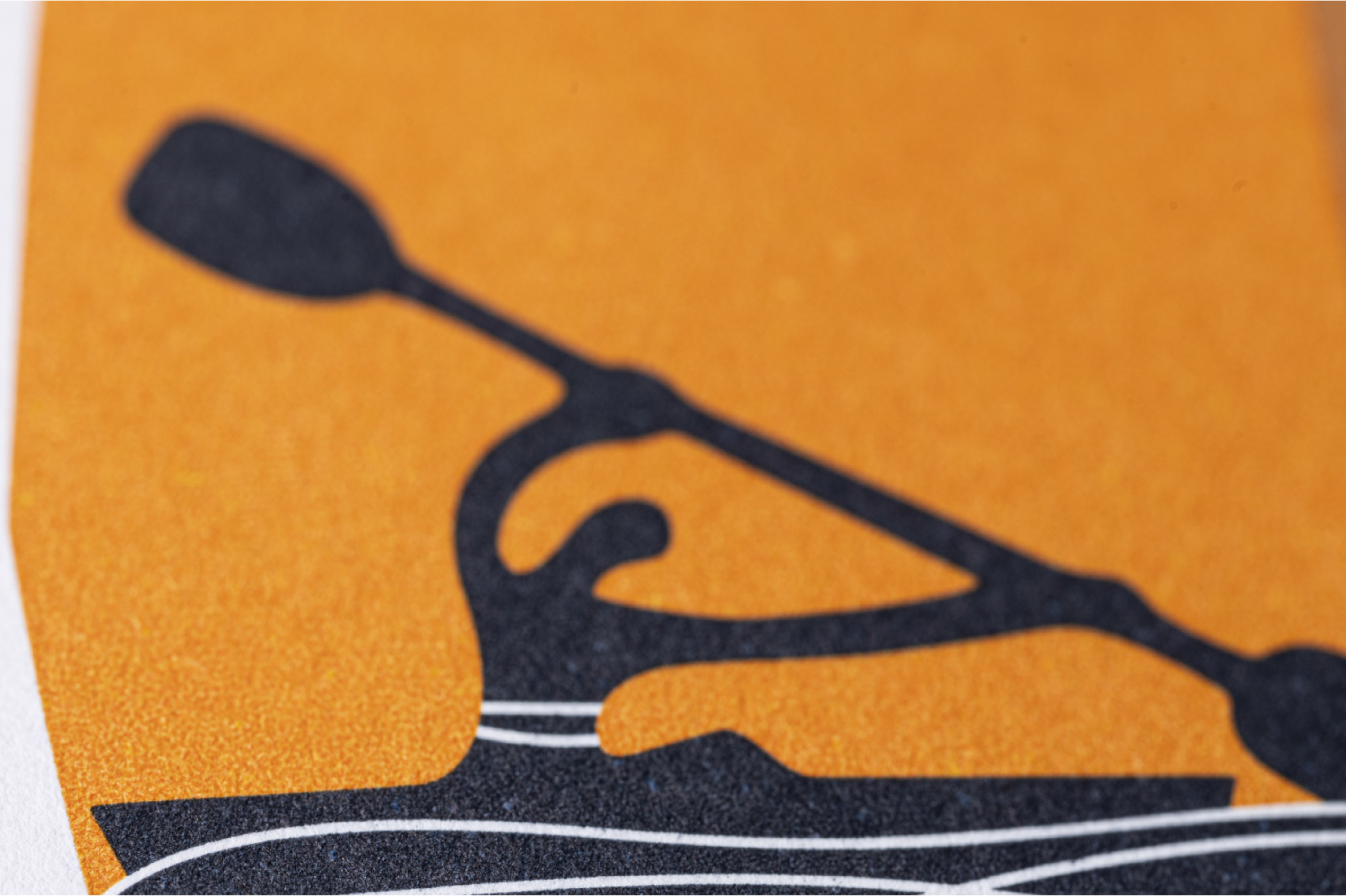
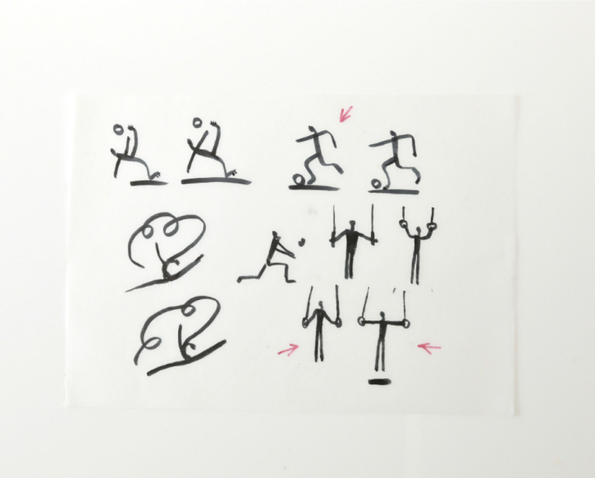
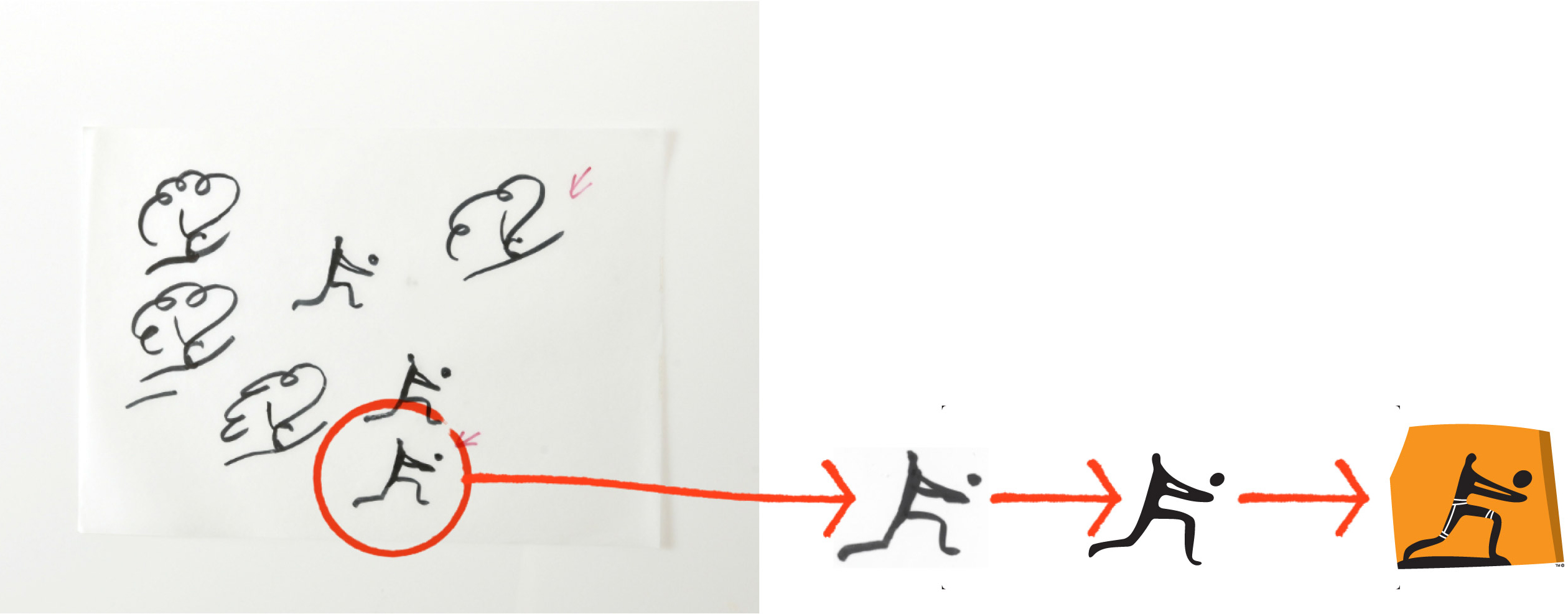
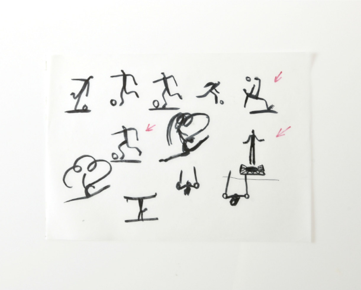
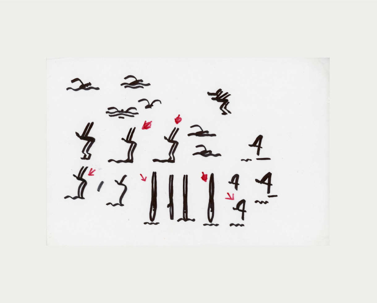
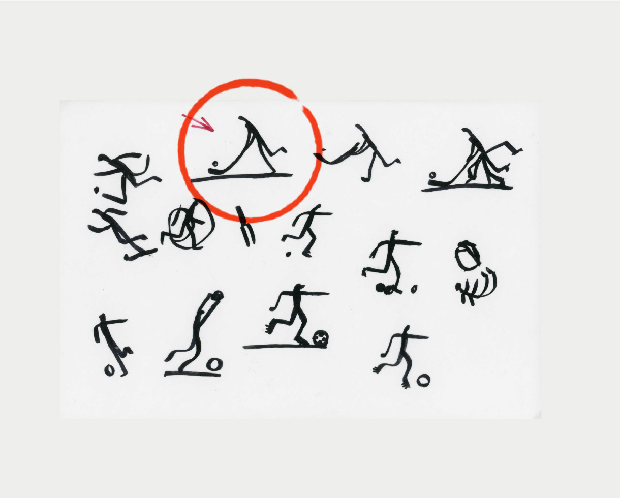
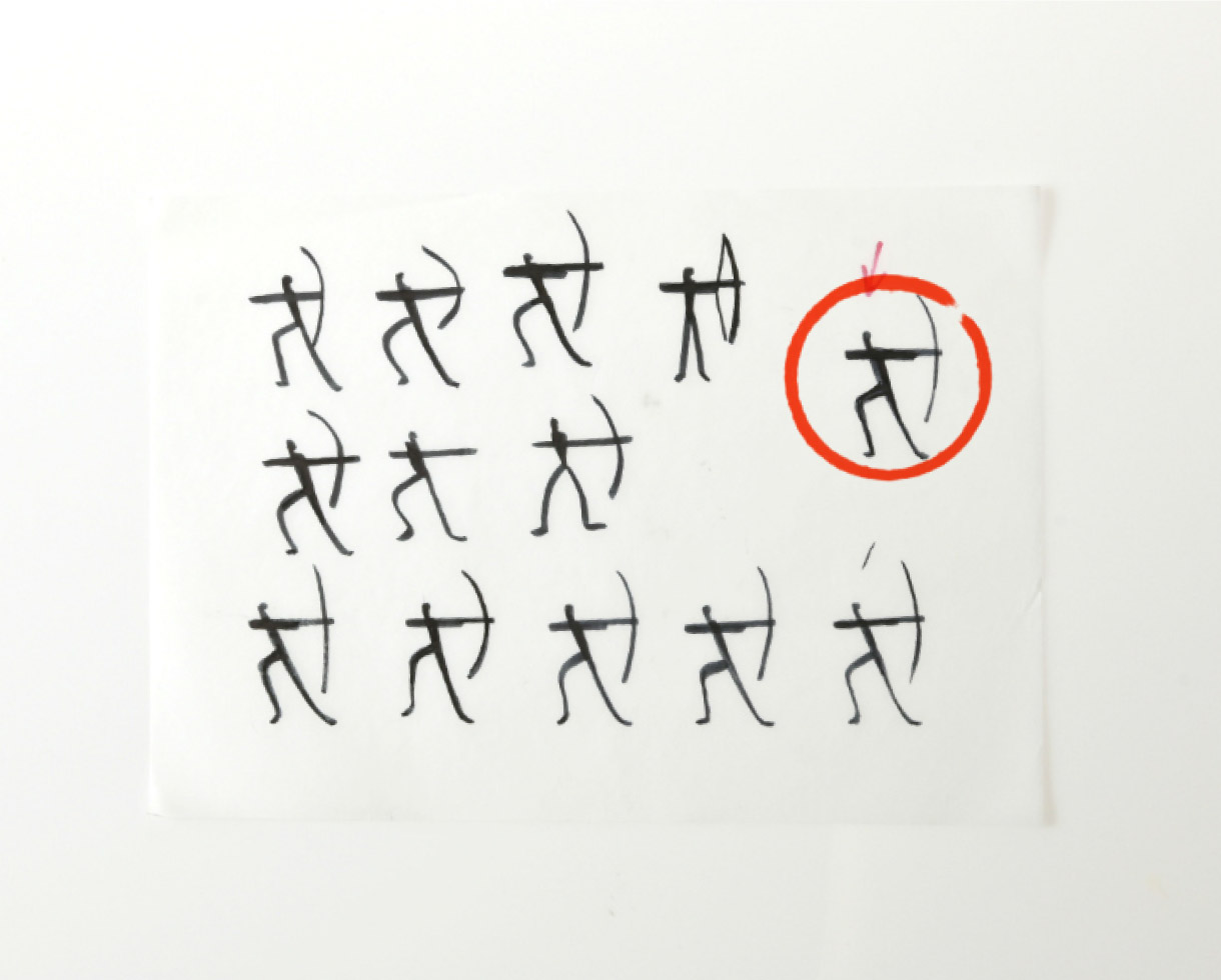
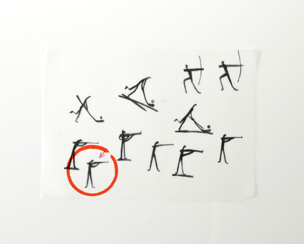
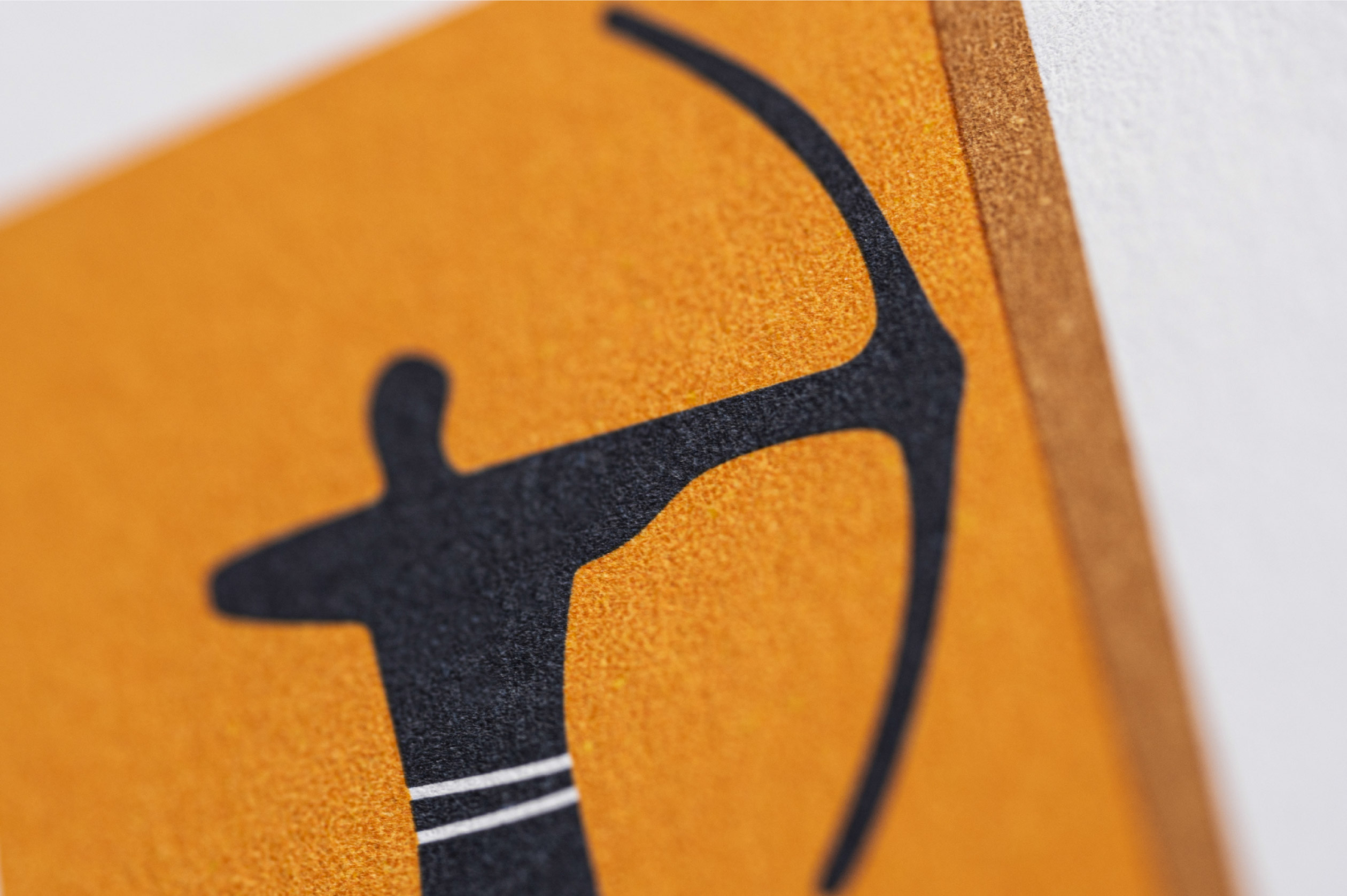
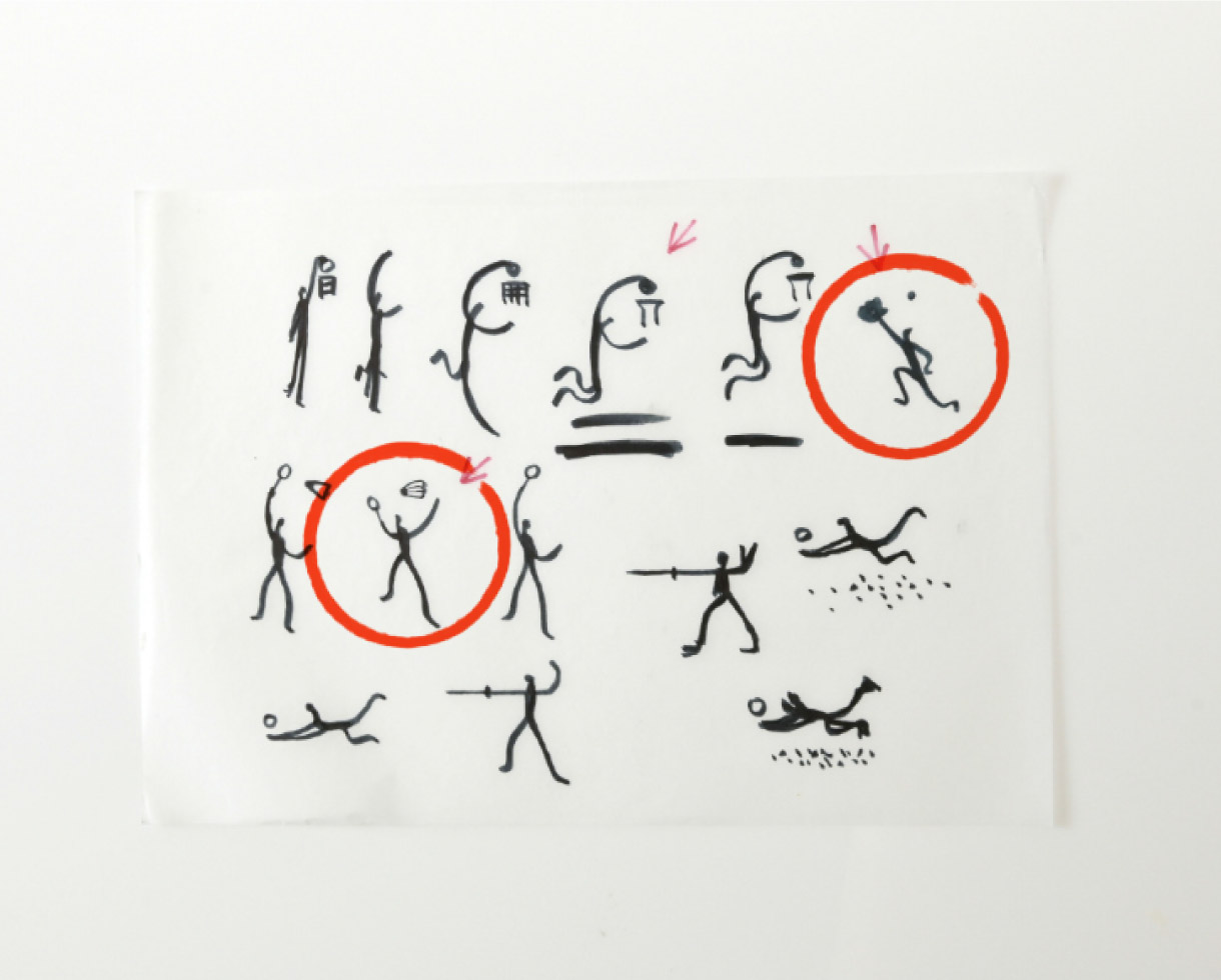
The ATHENS 2004 Sport pictograms were inspired by three focal points of ancient Greek civilisation. The simplicity of the human form is inspired by the Cycladic figurines. The Artistic expression of the Pictogram derives from the black-figure vases, where solid black shapes represent the human body and a single line defines the detailing of the form. The figures of the pictograms are solid and clearly drawn on a background similar to a fragment of an ancient vase.
While their inspiration was very artistic and cultural, the ATHENS 2004 Sport pictograms were aimed to be very accurate in depicting the most recognisable movement of each individual Sport and Discipline. They were approved by all International Federations and by the IOC.
On 24 February 2010, the New York Times examined the history of Olympic pictograms from their introduction at the 1936 Berlin Olympics until today. Praising the standard setting pictograms of the Mexico City (1968) and especially the Munich Olympics (1972), it singled out the designs of Yannis Kouroudis and k2design in 2003 for the Athens Olympics, placing them right at the top.
